
In a previous blog post, I explained how to export Spotify playlists for offline analysis. In this follow‑up, I take the next step and focus on turning that exported data into meaningful insights using Excel.
Imagine having a folder filled with Spotify playlist exports in CSV format and wanting instant insights in Excel. Not just from a single file, but from all files in the folder combined automatically — and updated just as easily when you drop in new CSVs. From there, the goal is to transform that raw data into something useful: a clean overview with a unique list of artists, how often each one appears, and ultimately a Top 25 ranking, complete with a chart.
This is the end‑to‑end story.
Quick steps

Pull data from a folder
Many people import a single CSV via Data → From Text/CSV. That works… until you have ten, twenty, or a hundred files. Then you want something smarter: Power Query “From Folder.”
What you do (one-time setup):
- Go to Data → Get Data → From File → From Folder
- Select your folder, for example:
c:\temp\Spotify playlist\ - Excel shows a list of files. Click Combine & Transform Data
- Confirm import settings (delimiter, headers, data types)
- Choose Close & Load into an Excel table
The big advantage:
Later, when you add new CSVs into the same folder, you don’t re-import anything. You simply click:
Data → Refresh All
…and your dataset updates automatically.
One combined dataset in a clean table
After combining, you end up with one consolidated dataset in Excel containing all rows from all CSVs — often including a column like Source.Name that records which file each row came from (e.g., 2021.csv, 2022.csv).
That’s incredibly useful because:
- you can filter by year/file later,
- you can analyze trends over multiple exports,
- and you keep a clean single source of truth for analysis.
Generate a unique artist list
Spotify exports often store multiple artists in a single cell, like:
Collie Buddz;Snoop Dogg;Jody HiGHROLLER
That’s one cell, multiple artists. To build a true unique artist list, you need to:
- split those values (on
;) - trim extra spaces
- consolidate everything into one long list
- remove duplicates
Copilot help:
Instead of manually figuring out the best way to handle those messy multi-artist cells, you describe the goal in plain language —
“I want a unique list of Artist Name(s) from Spotify playlist on the Artist sheet”
—and Copilot helps you build the structure fast and correctly.
The result is a clean list of unique artists on the Artist worksheet.
Count how many tracks each artist appears on
A list is nice, but insight starts when you also know frequency — how often each artist appears across all tracks.
Because collaborations exist, the logic becomes:
- count a track for an artist if the artist is listed anywhere in the “Artist Name(s)” cell,
- even if that cell contains several artists.
So a row like Protoje;Original Koffee counts toward Protoje and Original Koffee.
Copilot is useful here because it understands the intent and can help you extend your artist list with a column like:
Track count
Now you have a table such as:
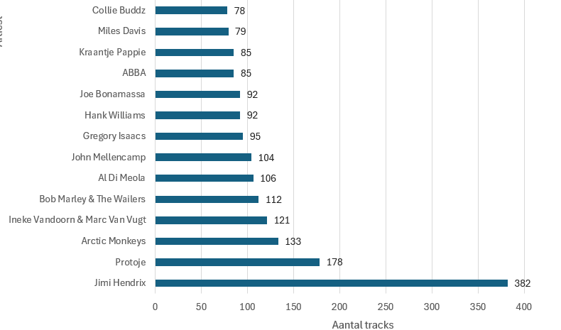
- Jimi Hendrix — 382
- Protoje — 178
- Arctic Monkeys — 133
…and so on.
Build a dynamic Top 25 ranking
Using formulas makes the model dynamic and keeps the entire process automatic. When new CSV files are added to the folder and the data is refreshed, everything remains in sync. The main table automatically grows, artist counts update accordingly, and the Top 25 recalculates without any manual intervention. There is no need to adjust formulas or visuals, which makes the solution scalable, reliable, and easy to maintain as the dataset continues to grow.
Once you have:
- Artist
- Track count
…creating a Top 25 is straightforward when using modern Excel formulas:
- SORTBY to sort descending by count
- TAKE to return only the first 25
- HSTACK to output artist + count side-by-side
Example:
=LET(
  a, Artist_list[Artist],
  n, Artist_list[Track count],
  TAKE(SORTBY(HSTACK(a,n), n, -1), 25)
)
Visualize it with a chart
A picture is worth a thousand words. Visualizing a Top 25 with a horizontal bar chart instantly makes the insights clearer and more impactful.
Copilot help:
“Add a chart that stays connected to the Top 25 output.”
To wrap things up, Copilot has become a really valuable addition to Excel for me. It helps me build formulas that would otherwise take more time to figure out, or require some extra digging. This allows me to move faster and keep my focus on the data itself and on creating meaningful visualizations. For me, that means not just saving time, but also enjoying working with Excel more and getting to insights faster.